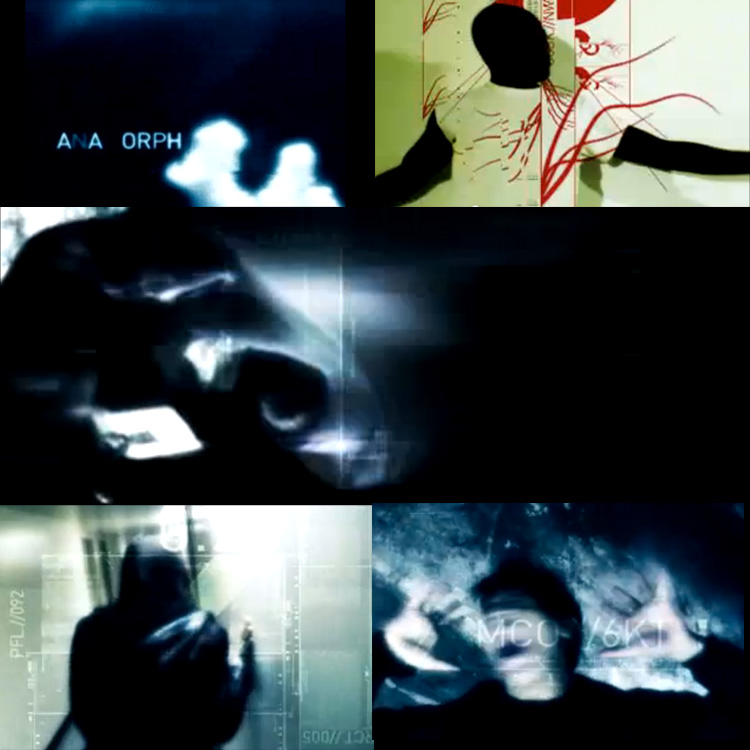
In 2001 motion graphics were beginning to grow up and had heavy influences from anime and tech and the rise of vector graphics that could be manipulated to serve any purpose from interfaces to title scenes. It was a pivotal time for design in general as the industry seemed to be moving away from the odd bleakness of pre-y2k hysteria and into an even stranger era of what I suppose could be summed up as the Martha Stewart Living aesthetic. Lots of orange, browns and creams. Lots of tiny Helvetica type on it's side and boxed within neutral rectangles. Although it seems somewhat trapped in time now, the point is that the aesthetic of pretty much everything was getting a more mature vibe. The initial internet hysteria was only beginning to become a normal way of life and with that maturity, came a sobering approach to design.
This was also, of course, the era of Weeeee, Y2Khai and soon after The End Of The World and other such nonsense. Although these animations are ridiculous, they are beautiful examples of the manifestation of the ever-emerging world of expression, and the ease of which people would soon share their consciousness of the world.
One of the most influential videos of my design-awakening was this, the classic Anamorph from WDDG. Every frame of this is beauty and even now, almost 12 years later, it is still an impressive production of art and design and music and passion.
Screen captures and video ©WDDG

